

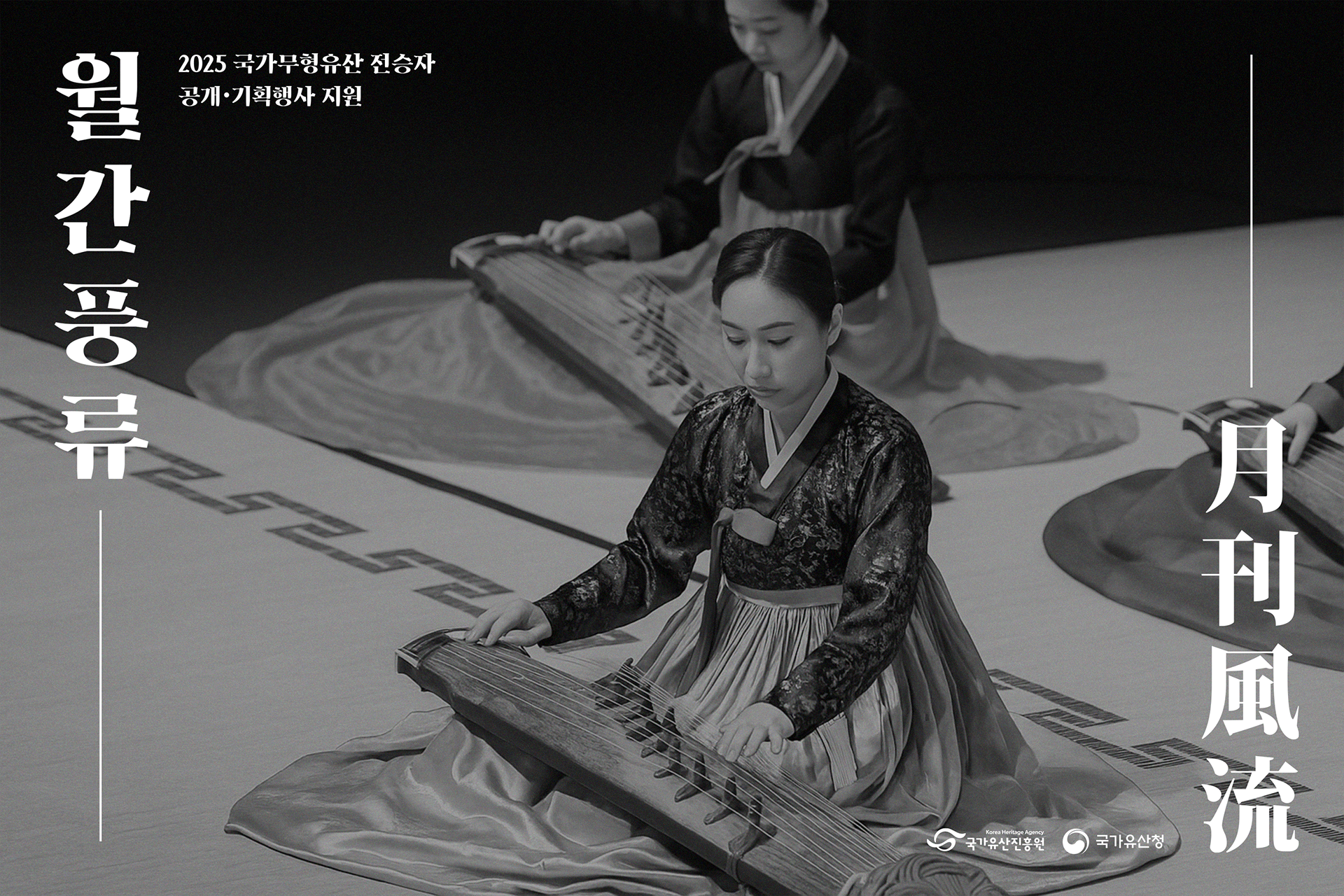
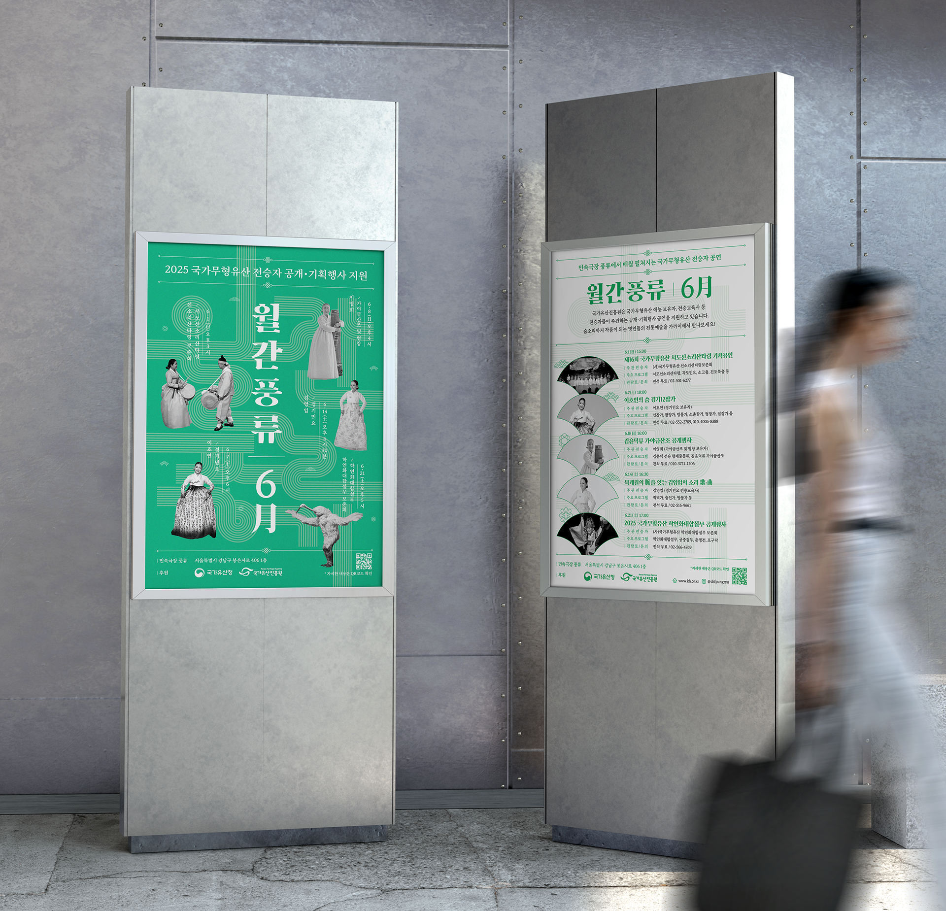
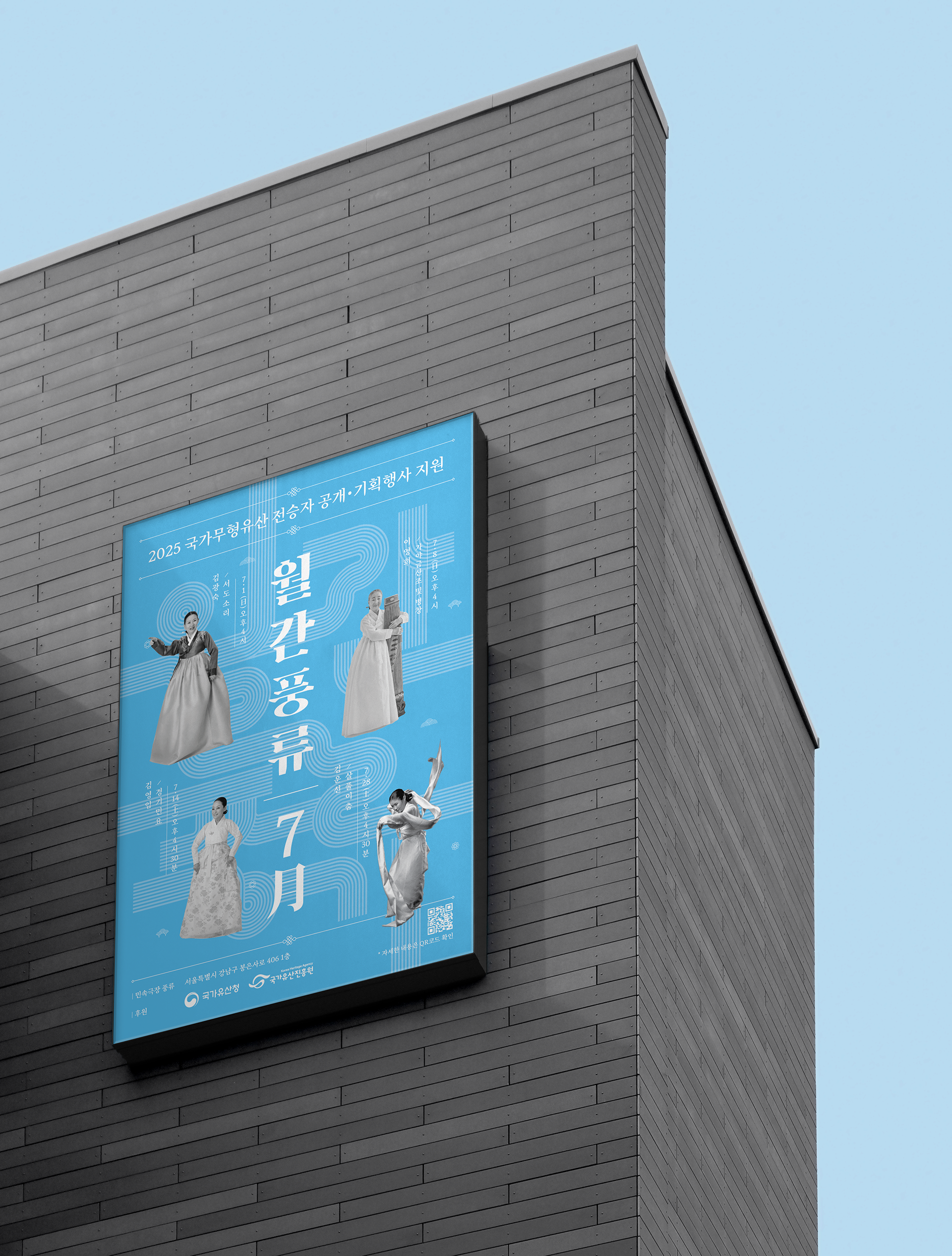
'민속극장 풍류'에서는 매월 국가무형유산 보유자 및 전승자들의 전통 예술 공연이 열리고 있었습니다.
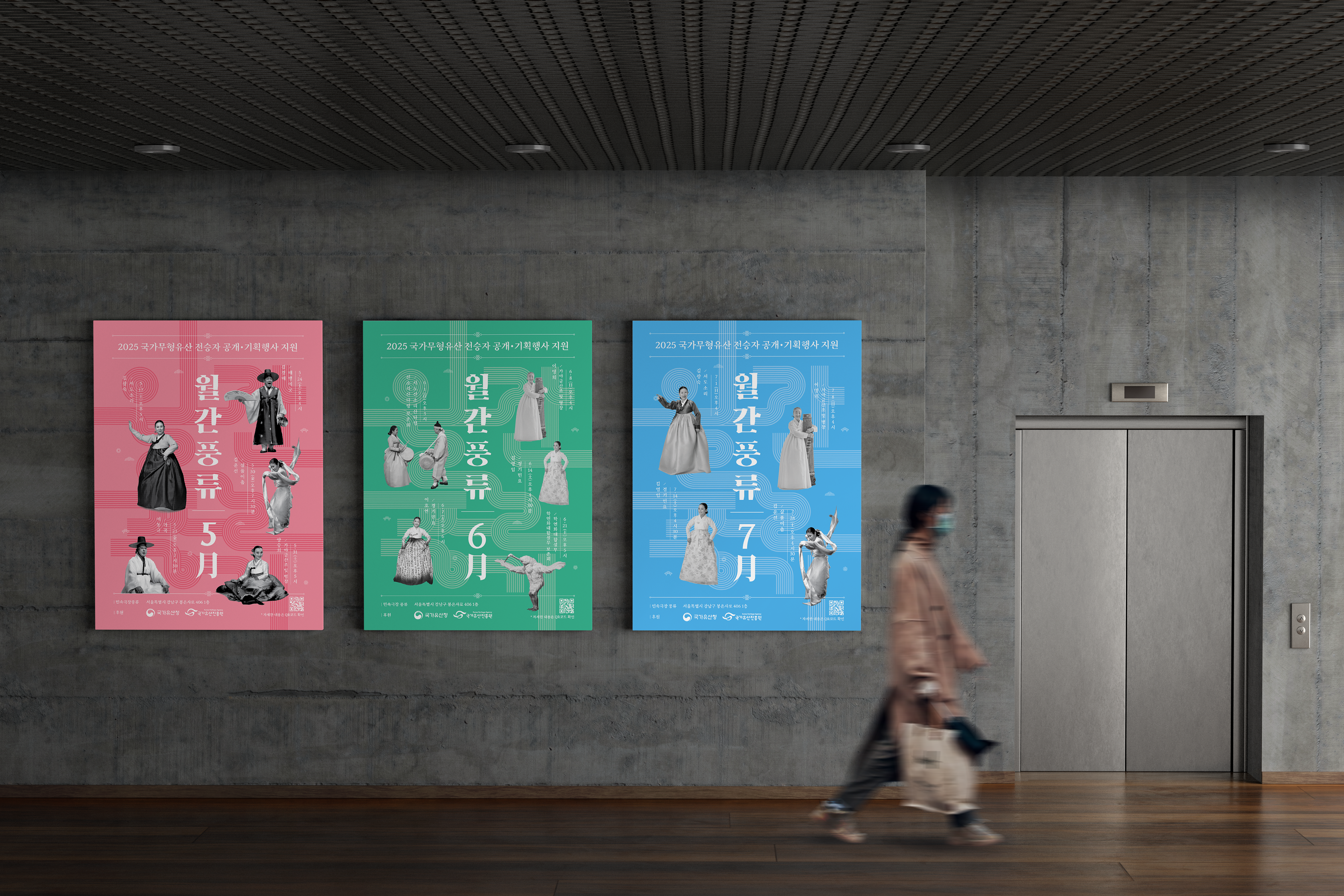
그러나 공연별로 제각기 제작된 홍보물은 누적되는 브랜드 가치를 형성하지 못했으며, 매월 진행되는 공연임에도 관객들이 연관성을 인지하기 어려웠습니다. 이를 해결하기 위해 풍류극장 중심의 통합 브랜드 '월간풍류'를 개발하고, 일관된 시각 아이덴티티 시스템을 구축했습니다.
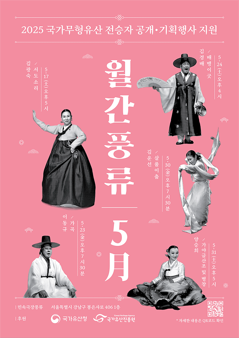
'풍류'의 전통적 본질을 유지하면서도 매월 새로운 포스터가 신선함을 전달할 수 있도록, 한국 전통 색채와 계절적 감각에서 영감을 받은 유연한 컬러 시스템을 적용했습니다. 공연의 역사성과 전통성을 현대적 시각 언어로 해석하여 시각적 완성도와 대중적 접근성의 균형을 추구했습니다.
특히 '월간풍류' 문자를 기하학적 문양으로 재해석한 타이포그래픽 패턴을 브랜드의 핵심 시각 요소로 설정해, 매달 다른 공연 내용에도 일관된 브랜드 인상을 유지하는 시리즈 아이덴티티를 구현했습니다.
'Theater Pungryu' hosts monthly traditional Korean performing arts shows featuring National Intangible Cultural Heritage holders and practitioners.
However, individually designed promotional materials for each performance failed to build cumulative brand value and made it difficult for audiences to recognize the connection between monthly shows. To address this, we developed an integrated brand 'Monthly Pungryu' centered on Pungryu Theater and established a consistent visual identity system.
We applied a flexible color system inspired by traditional Korean colors and seasonal sensibilities, allowing each monthly poster to convey freshness while maintaining the traditional essence of 'pungryu.' We interpreted the historical and traditional nature of the performances through contemporary visual language, pursuing a balance between visual sophistication and public accessibility.
The typographic pattern that reinterprets the 'Monthly Pungryu' characters as geometric motifs serves as the brand's core visual element, creating a series identity that maintains consistent brand impression despite varying performance content each month.
1. Title
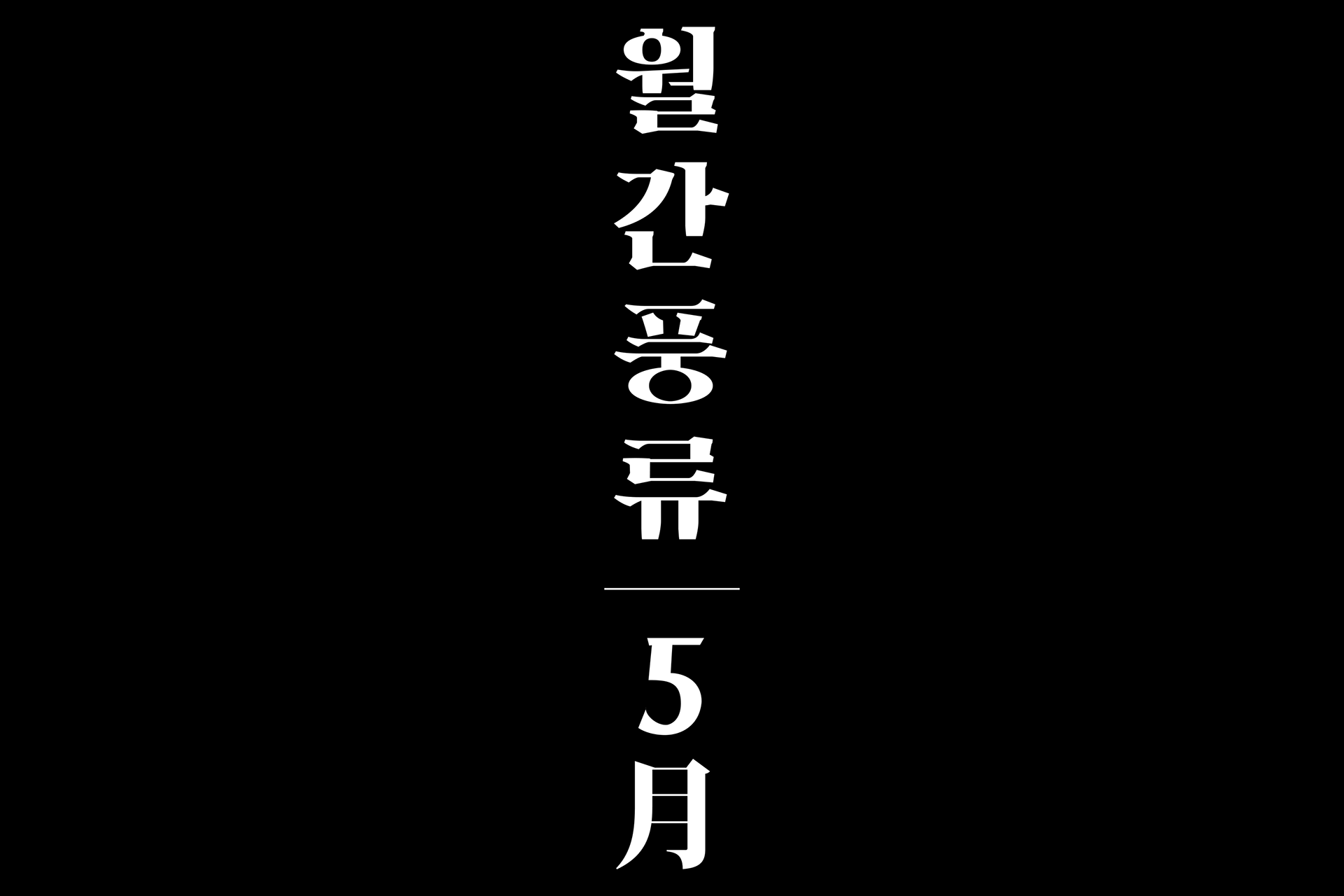
2. Typographic Pattern - 월간 풍류(monthly pungryu)

3. Promotional Material Design
월간풍류 프로젝트
Monthly Pungryu: Korean Traditional Arts Poster Series
· Client: Korea Heritage Agency (국가유산진흥원)
· Visual Identity, Graphic Design: Studio Brick