


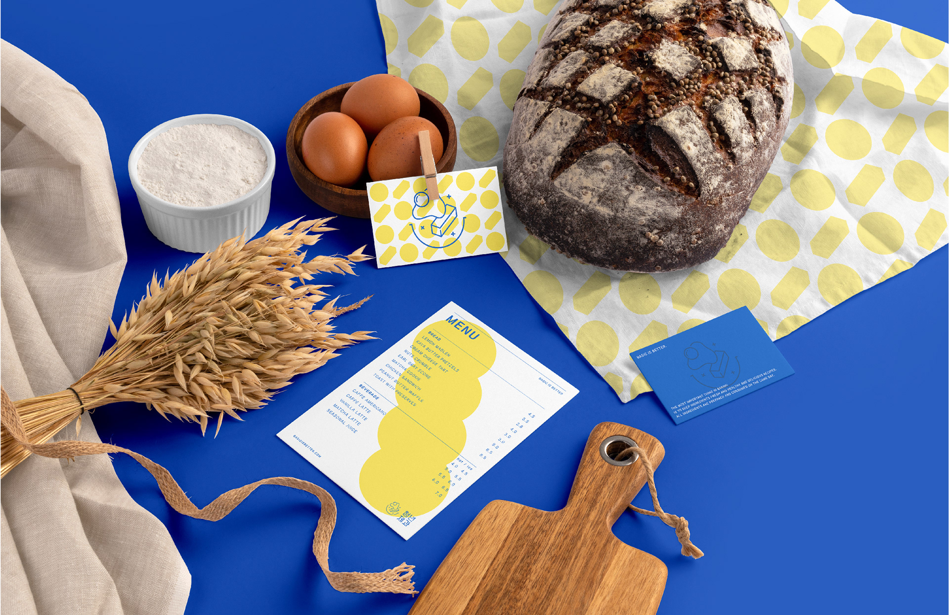

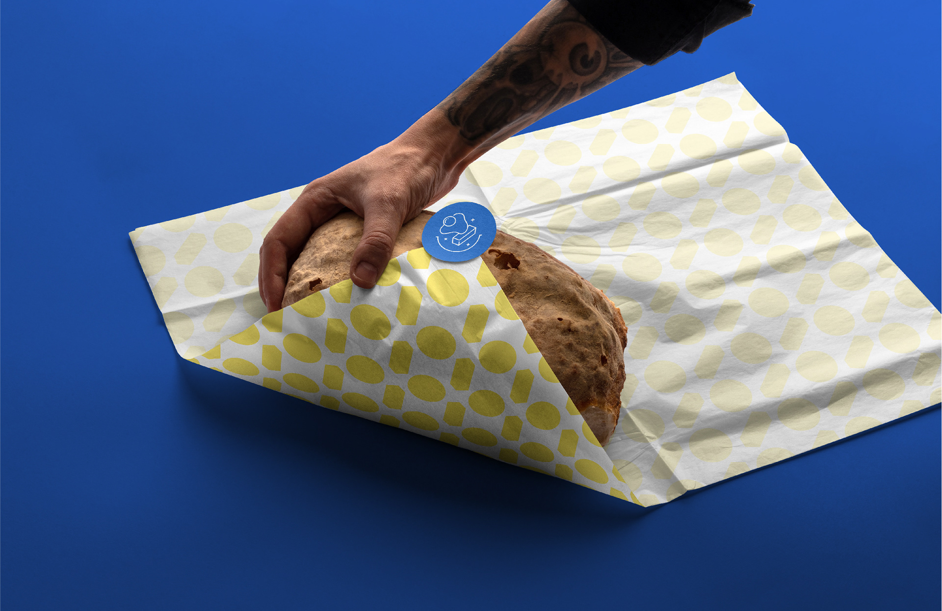
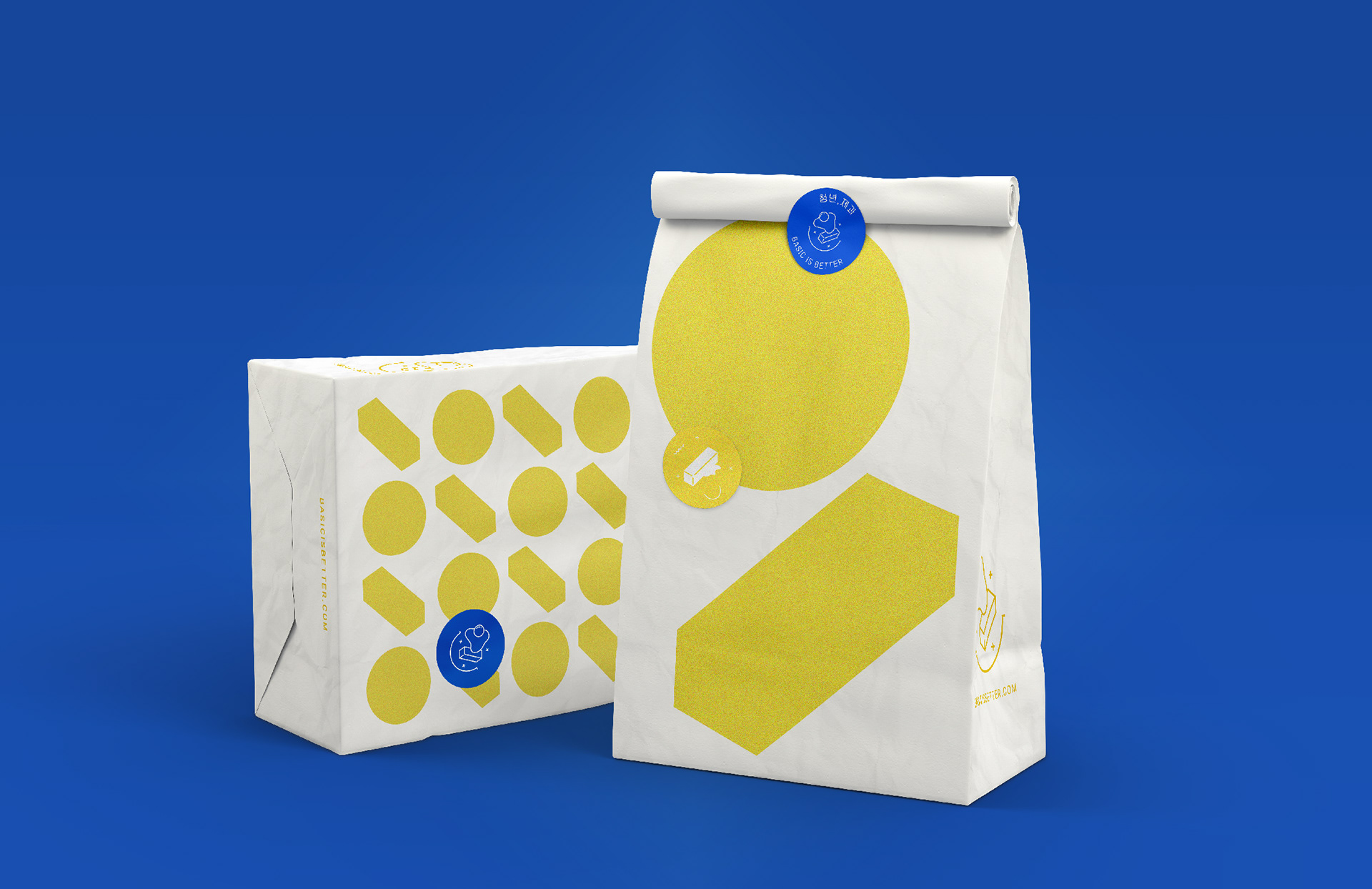
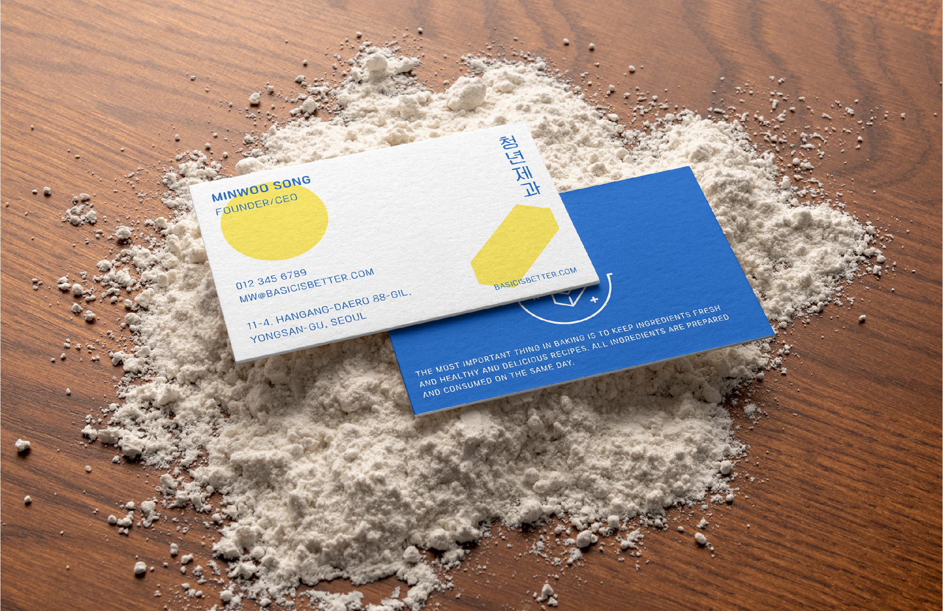
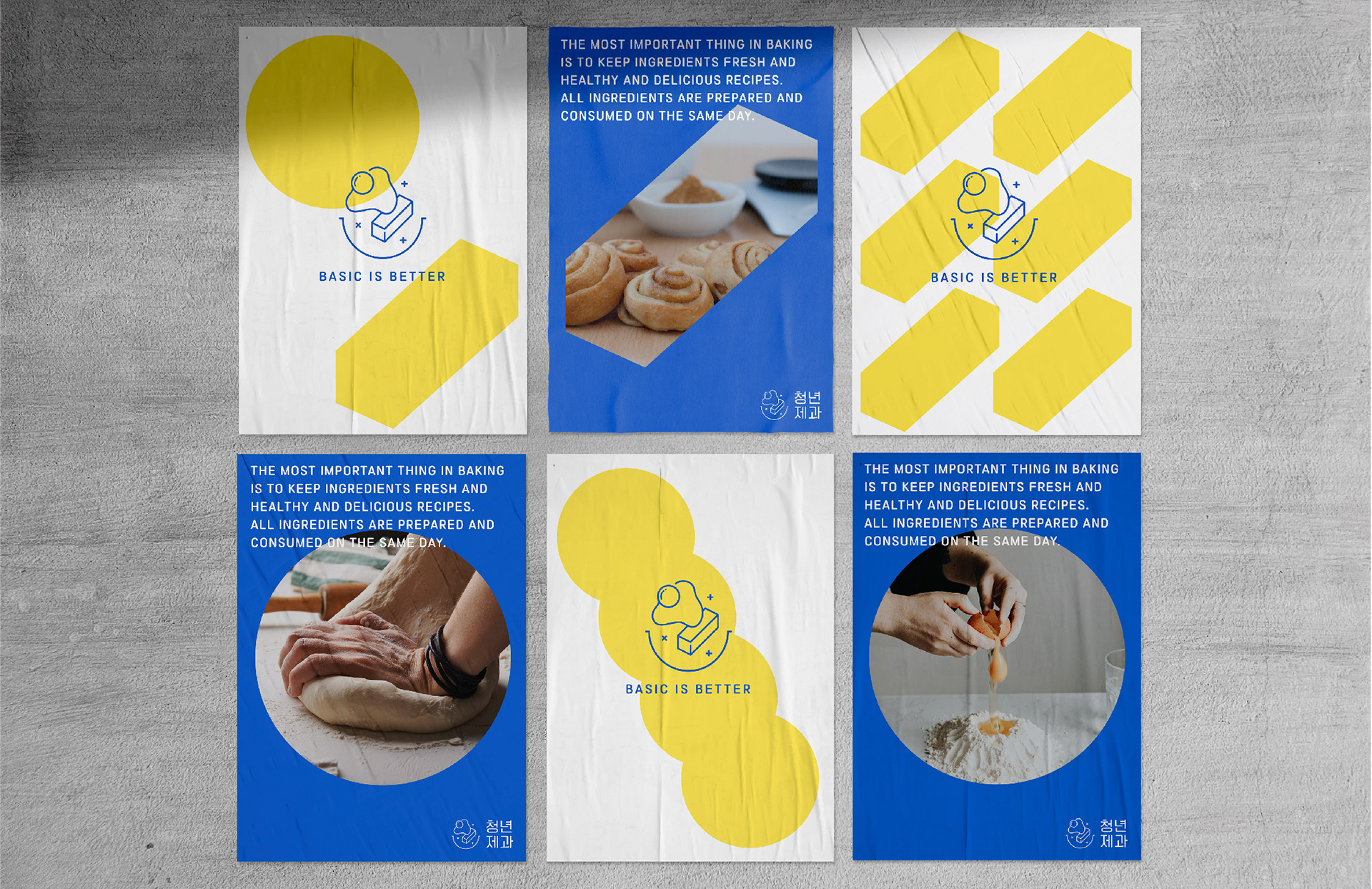
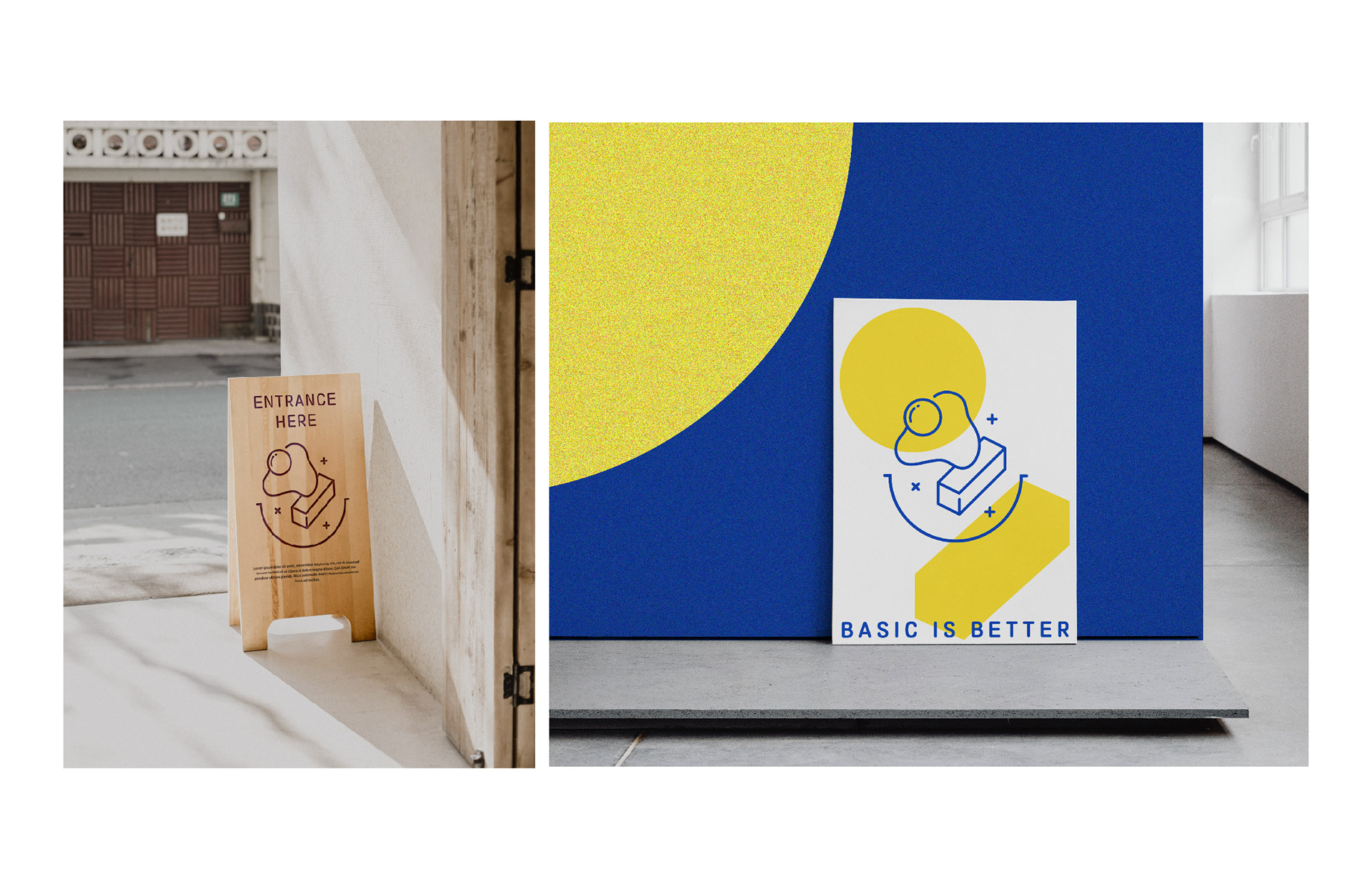

'Basic is Better' is a brand focused on making high-quality bread that stays true to the fundamentals of baking. To visually represent this philosophy, a new brand identity and packaging design were introduced.
The symbol is designed to symbolize eggs and butter, emphasizing the freshness and honesty of high-quality ingredients, while the use of primary colors, yellow and blue, adds vitality. The font and graphics are based on basic geometric elements to convey the bakery’s philosophy in a modern and intuitive way. The design of 'Basic is Better' effectively expresses the essence of baking, reflecting the brand's quality and values seamlessly.